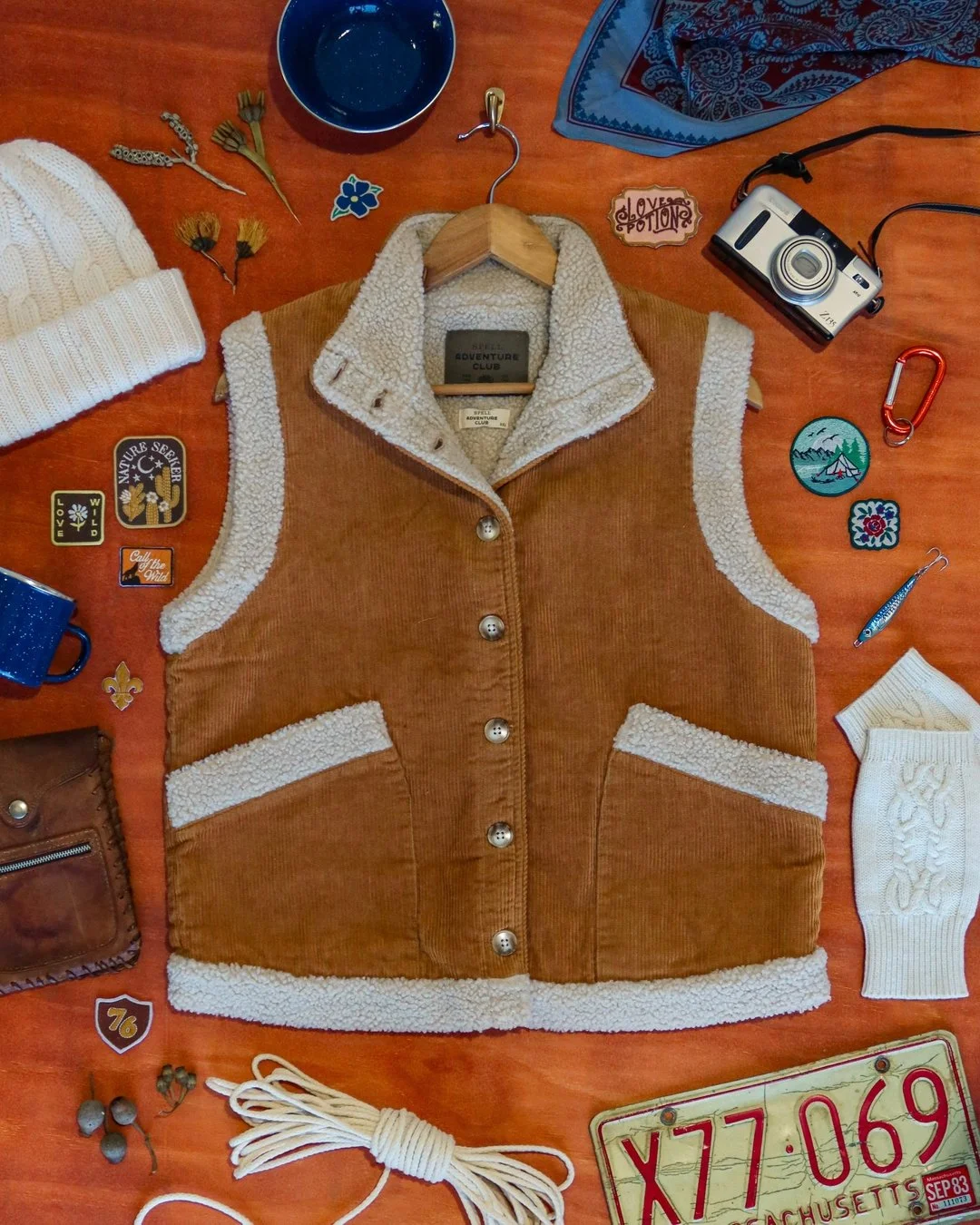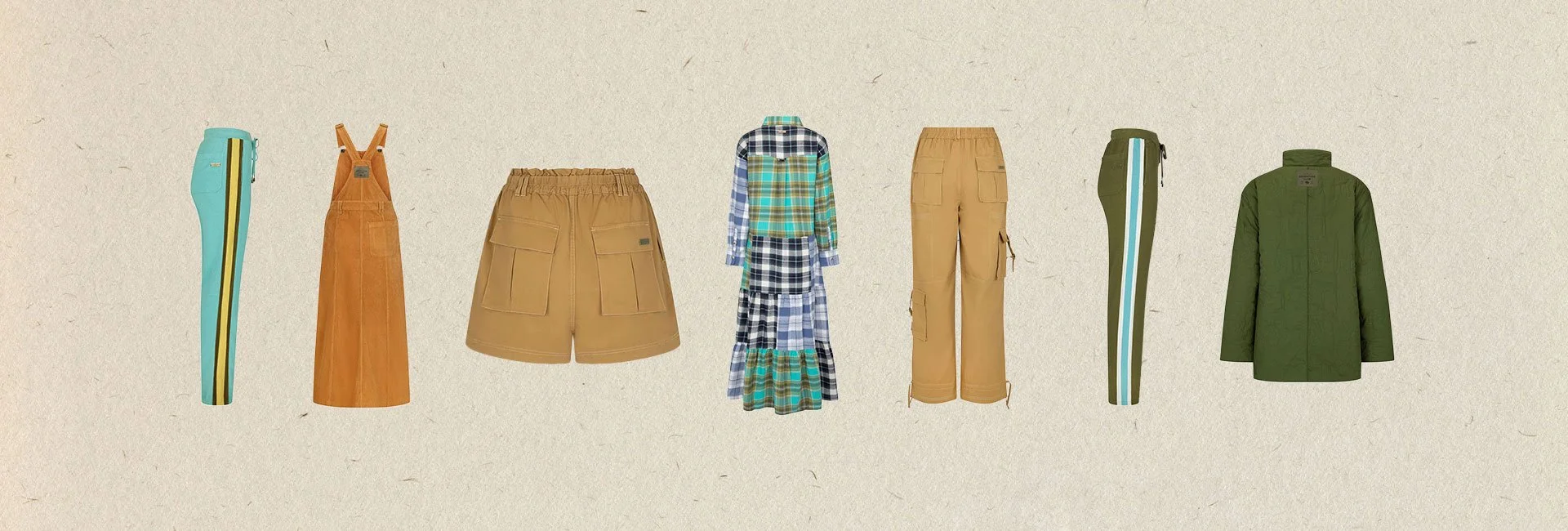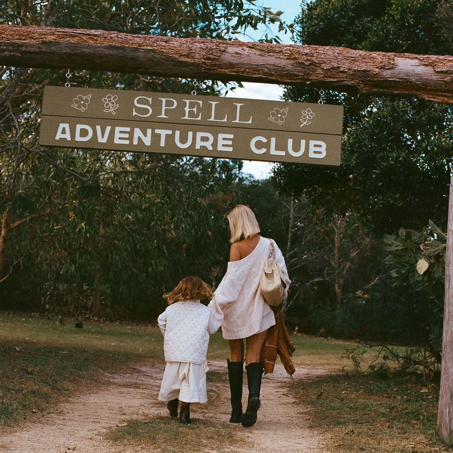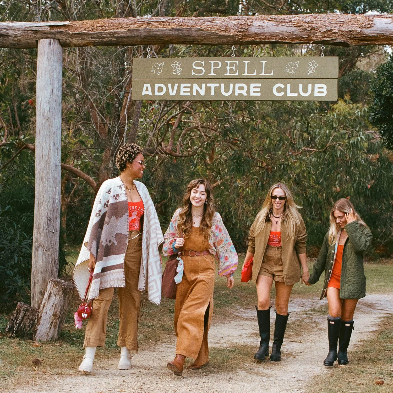
Spell Adventure Club is a lifestyle outdoor capsule created by Spell, designed to offer a distinct aesthetic from the mainline collection. While still sitting under the Spell umbrella, it called for a unique visual identity - something that felt like an escape into nature, yet grounded in the brand’s ethos.
I worked closely with Spell’s Creative Director, Co-Founder and CEO to bring this vision to life. The concept was clear: evoke the nostalgia of school camp by the lake, drawing inspiration from vintage outdoor brands, classic camping gear, and USA National Park merchandise and memorabilia and bring it a new edge.
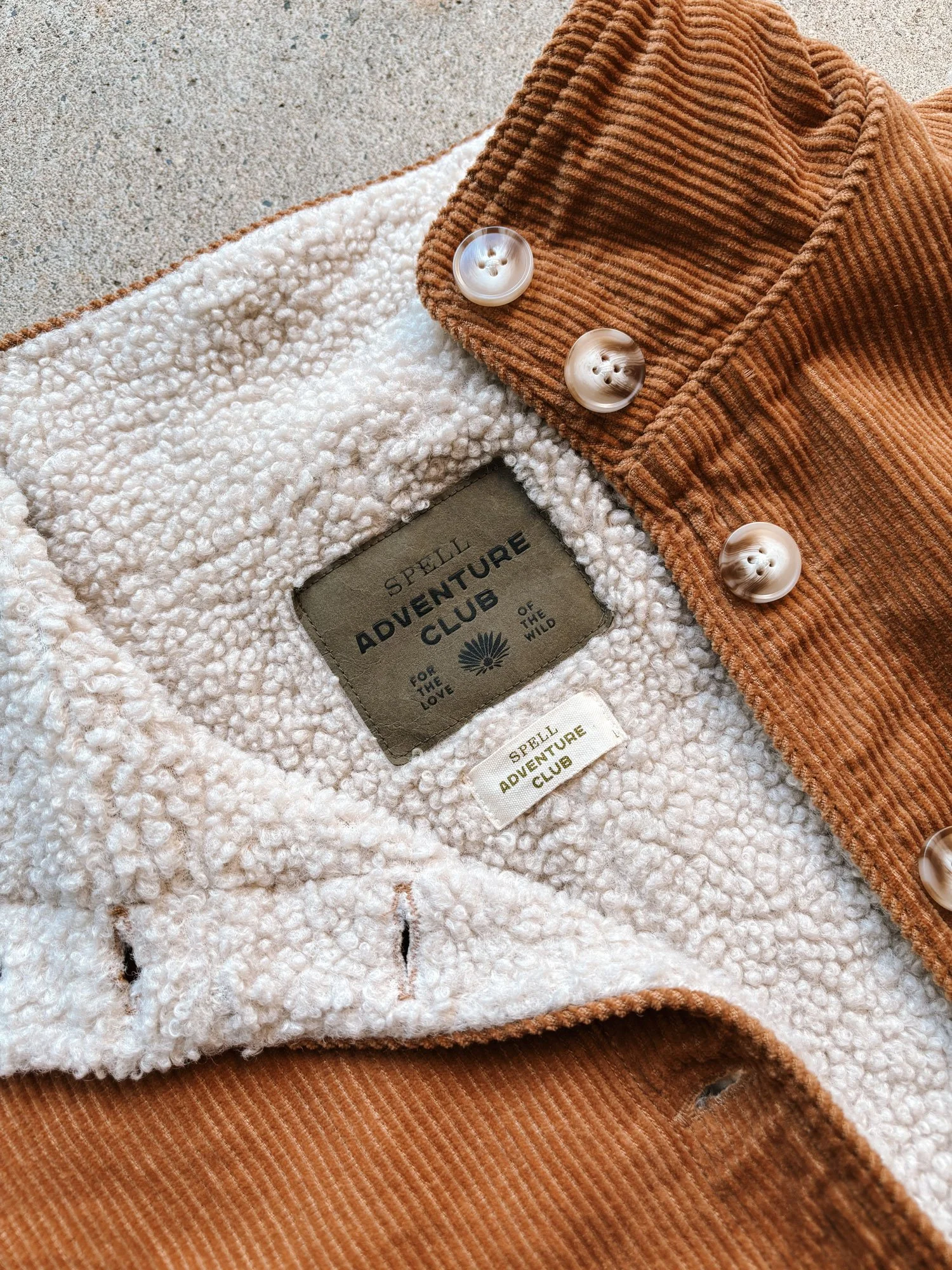
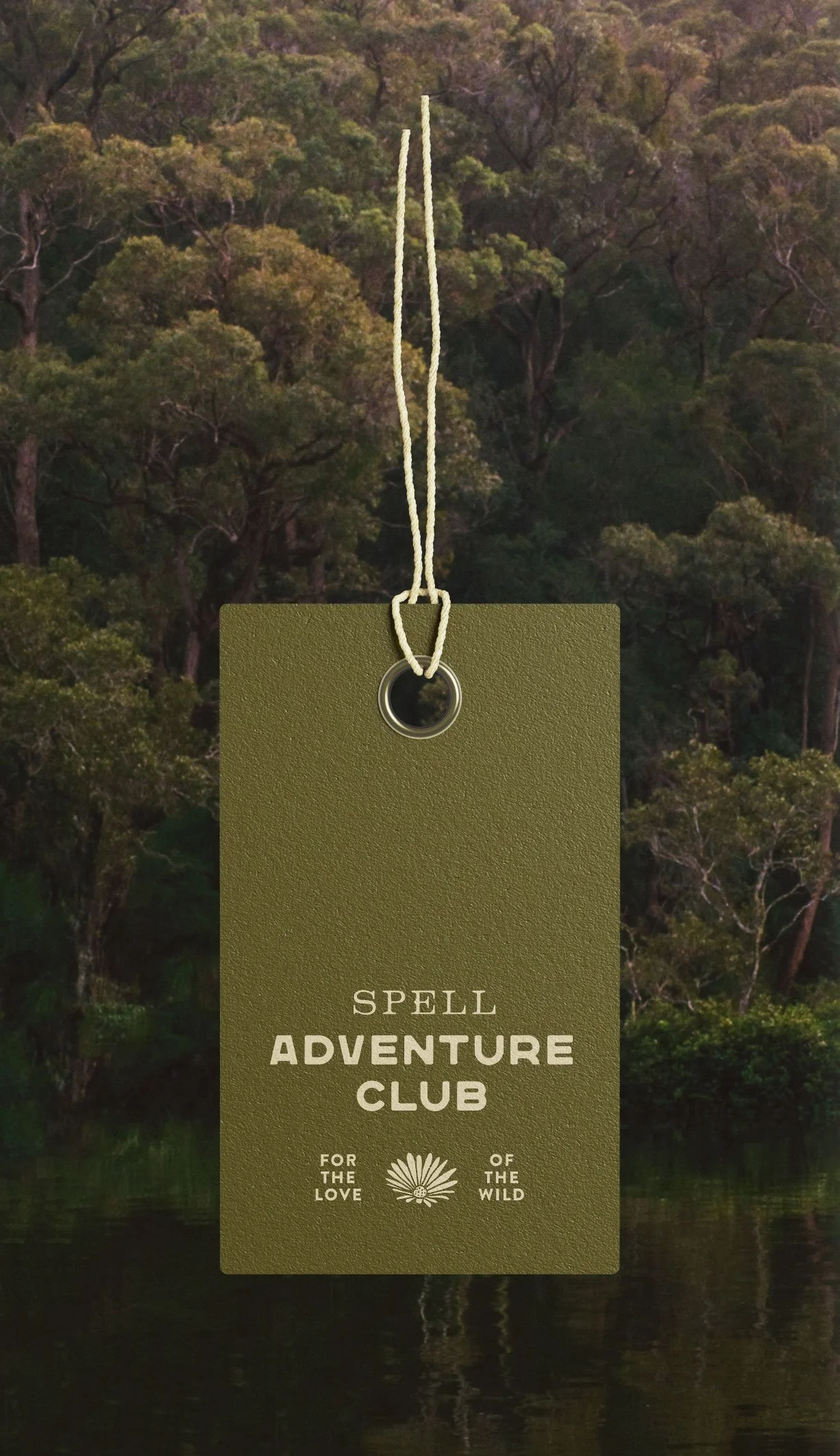
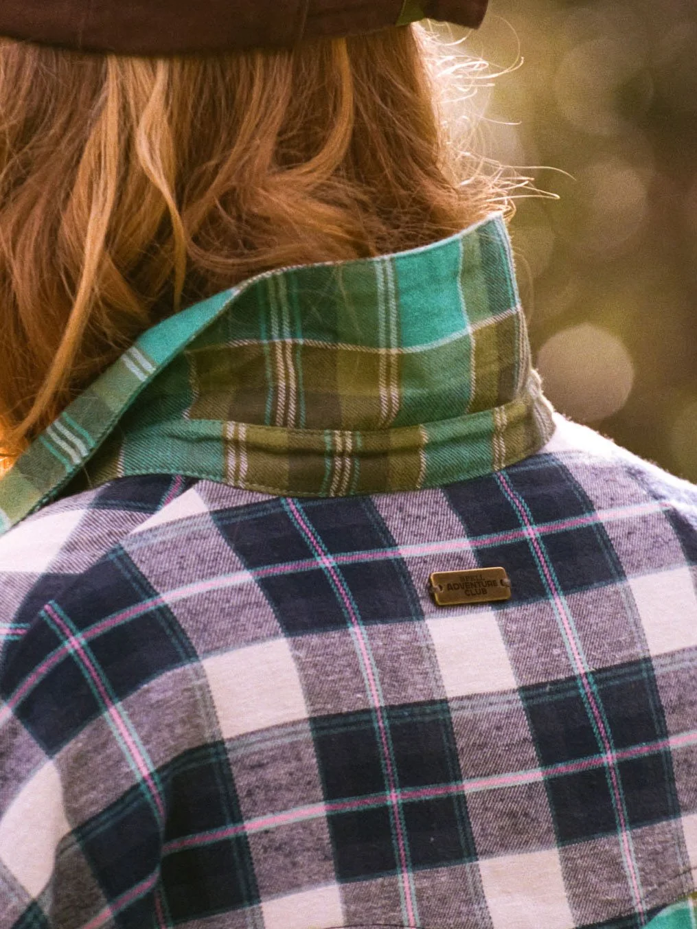
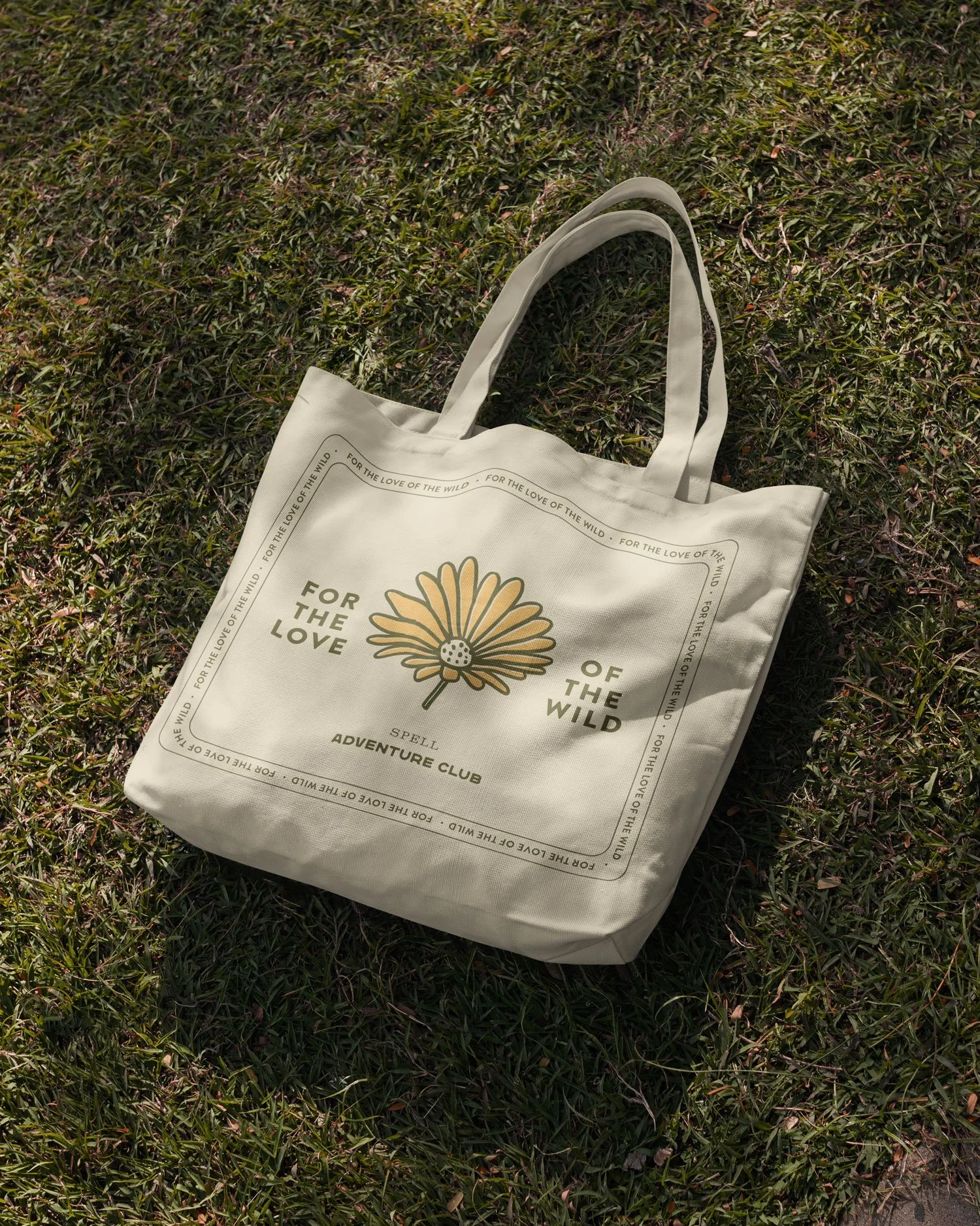
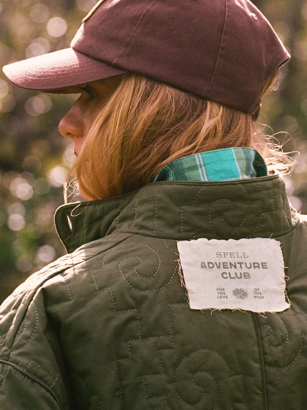
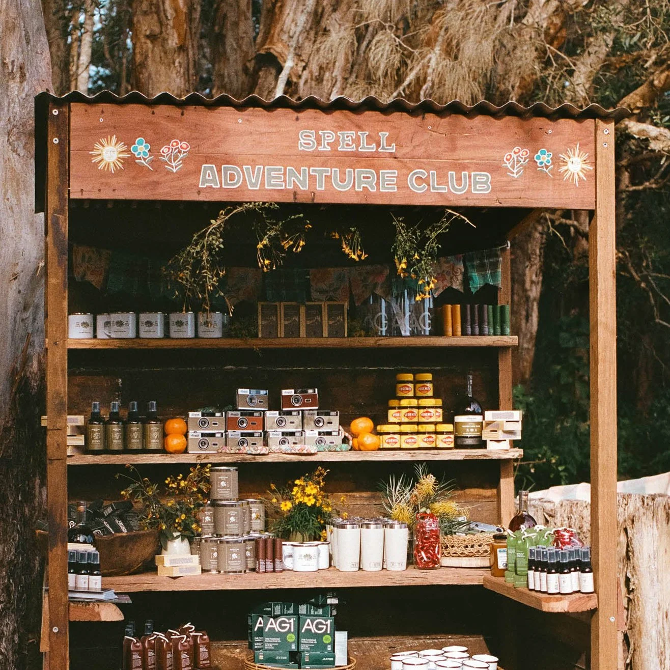
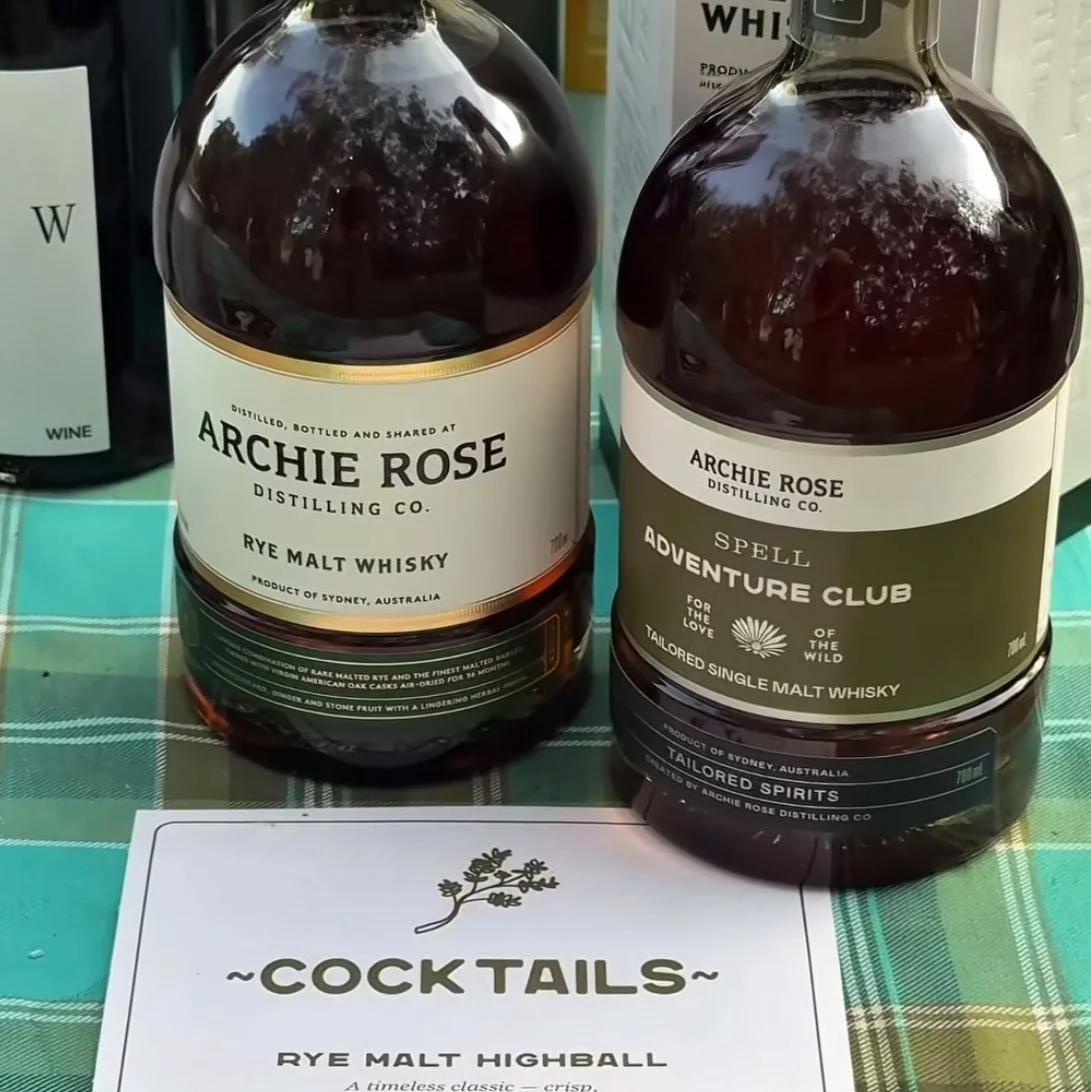
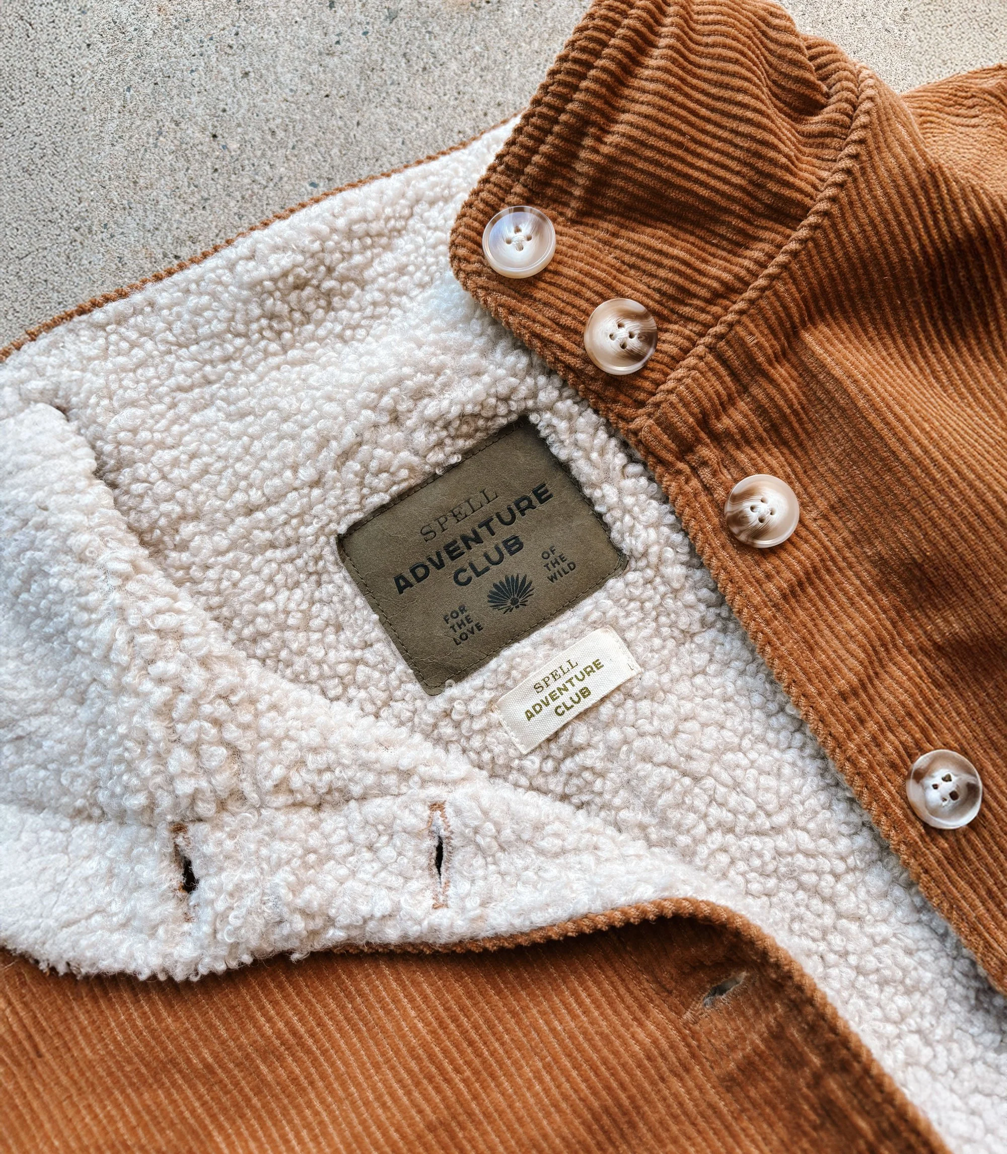
The branding needed to feel tactile and authentic, working seamlessly across metal hardware, woven patches, and leather goods to give the pieces their own identity. I collaborated with the wider team to bring these elements to life, and I also created a comprehensive set of brand guidelines for Spell Adventure Club. This has ensured the sub-brand’s visual direction was clearly defined and has been consistently followed by other team members across the business.
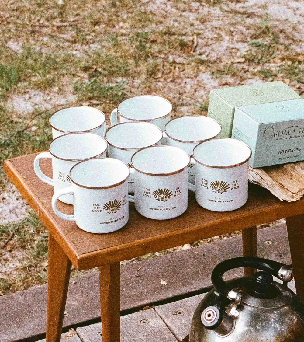
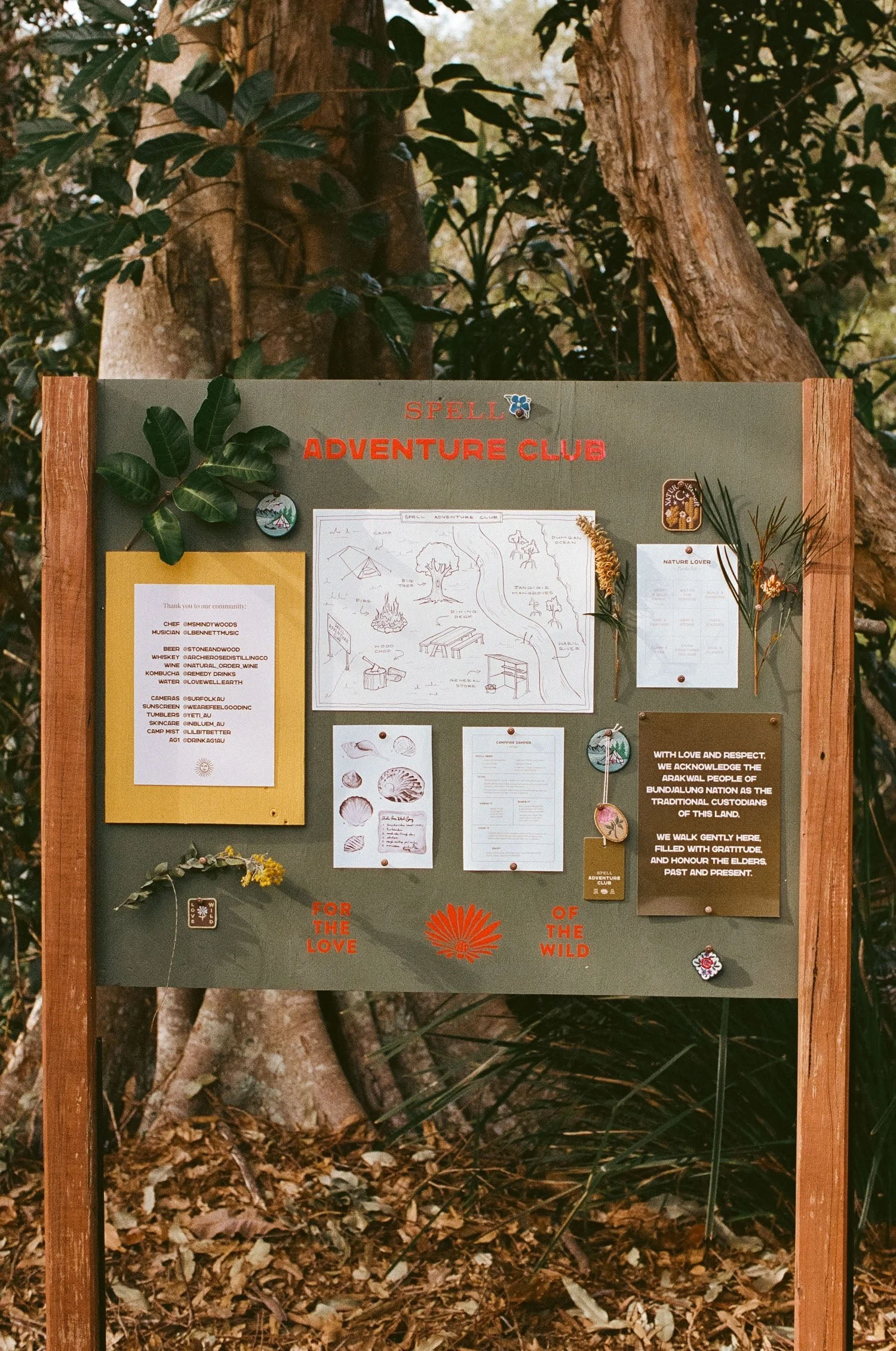
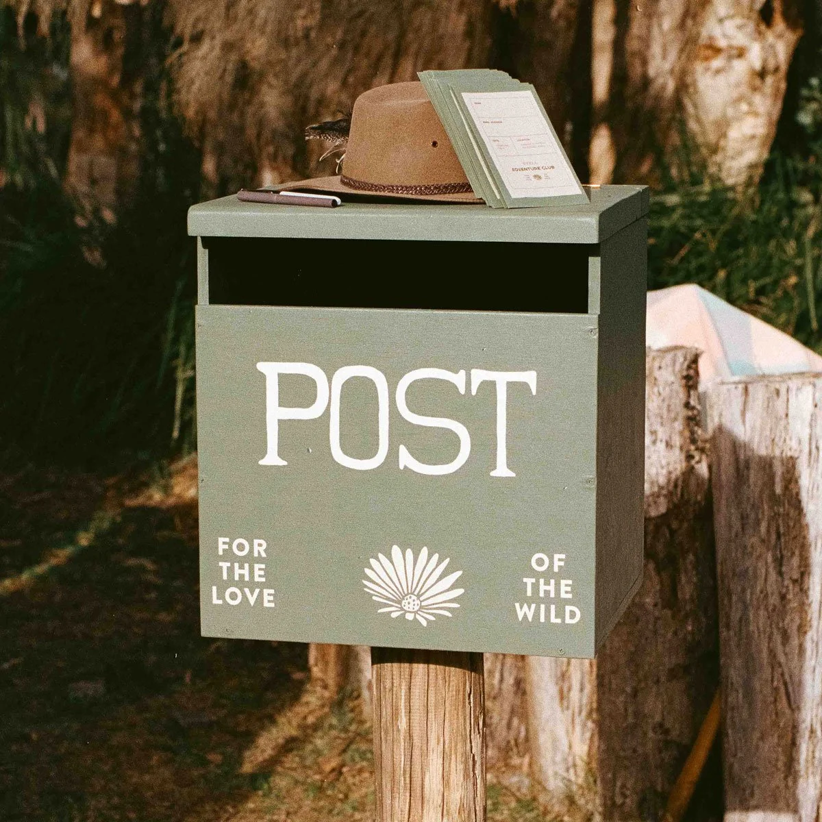
For launch, Spell hosted an event where the visual language came to life through every touchpoint, from craft books and mugs to maps, bags, signage, and homewares - creating a cohesive, immersive brand experience of Spell Adventure Club.
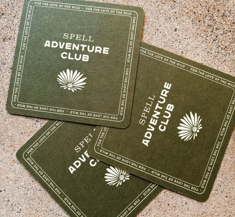
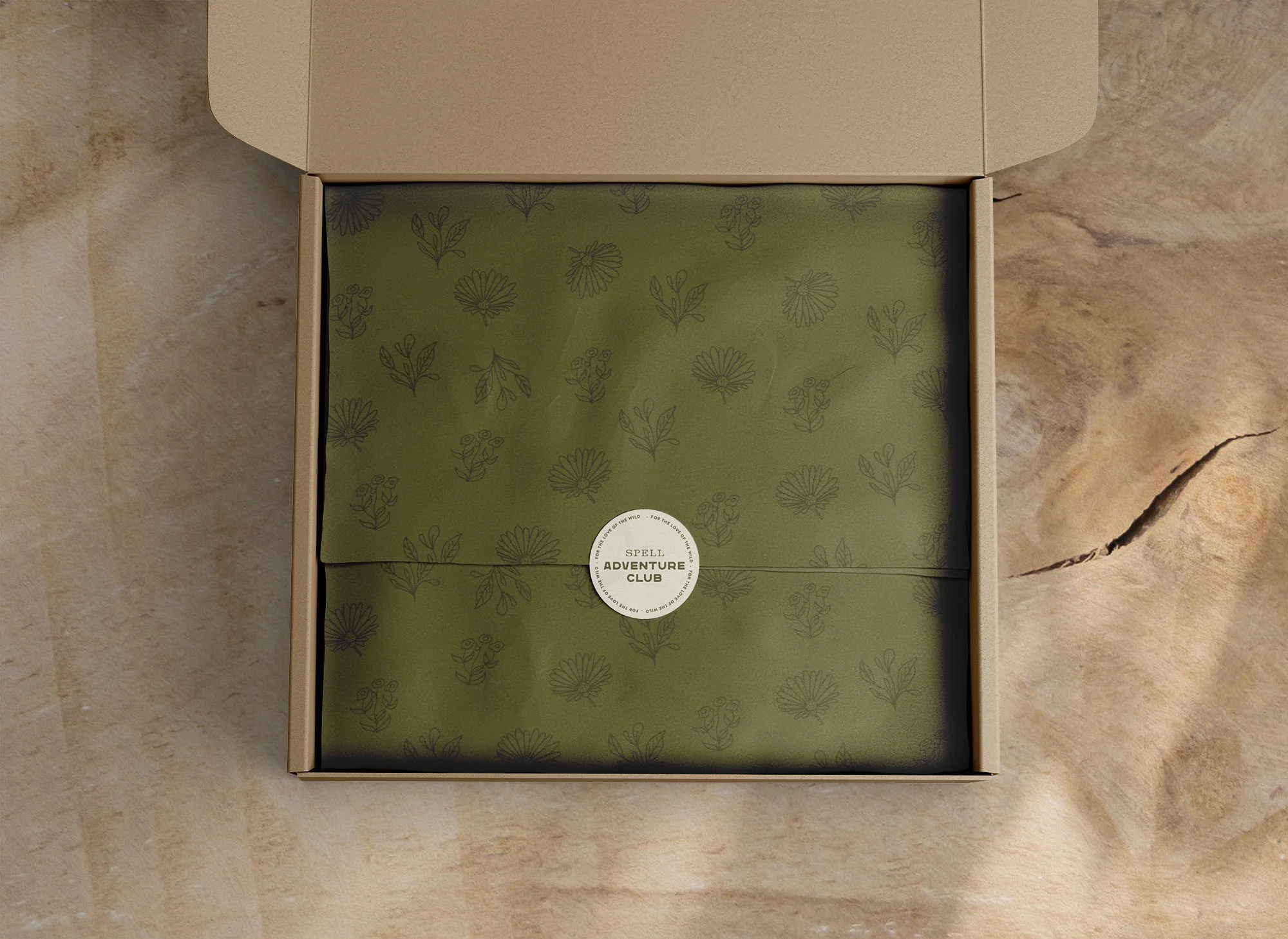
Images: Main logo • Logo variations and brand illustrations • Branded image treatment • Leather patch • Swing tag • Metal tag • Coasters • Tissue. • Flatylay aestetics • Additional labels • Launch homepage • Branded tags and patches used on garments • Branded event rollout material
Branding and conception rollout
PROJECT MANAGEMENT
Spell Adventure Club